It is with great satisfaction that I post The Industrial City. It's the first new tour on the site in almost two years, and brings together a lot of sites that I've been interested in for many years with some that are almost brand new to me. I first photographed the gasometers of Shrewbury in 1995; I did not discover Granite City Steel till last summer.
There was no strict criteria for inclusion; I simply documented the sites which impressed me most -- be it with scale, complexity, design, or state of decay. Many have historical value; most are many decades old. The golden age of St. Louis industry, as with most of the country, is long past.
The information on the tour is vastly incomplete, of course; I could make a small career out of digging up the full histories of these sites, the companies that built them, the persons who shaped them, their prospects for the future. I have culled what I could from my limited resources and the Web; perhaps some future trip will allow me time for more intensive research. For now, though, my greatest intent is to document -- to share my findings, to show what's there now and, in many cases, what may not be there much longer. Any additional information is a bonus.
Sometimes even my own information gathering is incomplete, limited by time, knowledge, and the frequency with which industrial sites are gated and fenced. No close approach to Cahokia is possible without passing a manned entry gate. Granite City Steel is only photographable by walking along a fairly busy two-lane highway with no sidwalks, with plant security cruising back and forth suspiciously looking at the guy with the camera. And entry to the extremely deteriorated Armour and Hunter plants is not for the faint of heart.
These sites are standouts to me; though some are among the city's most prominent landmarks, they barely scratch the surface of manufacturing and other industrial concerns throughout the city (most prominently, I have almost nothing related to the intensive barge traffic on the Mississippi River.) Much has already passed away; I barely caught the Belcher building as it came down in 2001.
So, there's a lot more I could have done, and more that will be done, but for now, I hope my readers will find some measure of illumination in seeing some of St. Louis's great industrial sites brought together in one place.
Monday, December 11, 2006
Sunday, December 03, 2006
Photo dumping ground
http://www.flickr.com/photos/repowers/
I've become quite the Flickr.com addict in the last few months; it's an easy-to-use forum that allows quick organization of photographs. They can be sorted into sets and sent to group "pools" on an almost infinate number of topics. The last few times I've been in St. Louis, the first thing I do upon getting home is upload a trip sampler to Flickr. It also lets me show off the best of my photography, something that the subject-contrained nature of Built St. Louis doesn't always allow.
I've been setting up albums on a variety of topics that interest me:
- Milwaukee's industrial architecture, especially the Cream City brick variety;
- Mid-Century Modernism around Milwaukee;
- Louis Sullivan's buildings across the country;
- 1950s-era signs;
- the buildings of Philadelphia architect Frank Furness;
- the Milwaukee Art Museum;
...and whatever else grabs my eye. The easy-to-use format means I can update it quickly and frequently, without the painstaking effort that goes into a normal web page.
Come by and check it out!
Monday, November 27, 2006
Long St. Louis weekend
I just had a spectacular weekend in St. Louis...
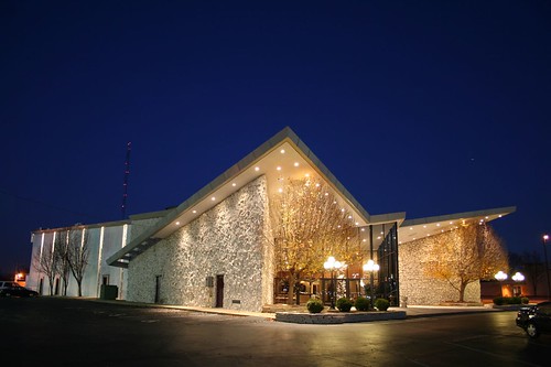
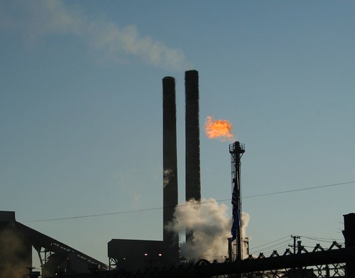
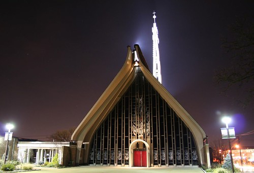
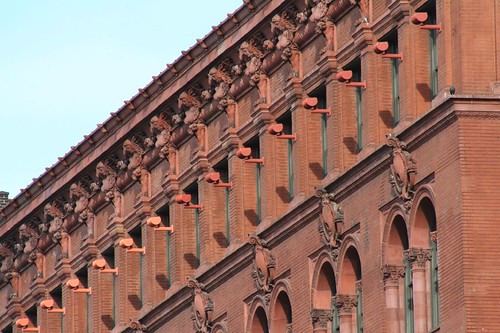
...but then, I always do.
More shots on my Flickr account -- bear in mind that's just a sampler of my weekend, just the highlights.
This weekend marks my fifth trip to St. Louis since May. With the chaos of the holiday season, the onset of winter, various personal concerns, and the need to plow through several thousand photographs and many many site updates, I probably won't be back in town till the spring.
Heh. I say that now, but the town always pull me back. I start to go a little crazy if I'm away for more than a few months.
Monday, October 16, 2006
Wilmore Park revisited
Lately I have been sorting my old photos from south St. Louis, home of richly beautiful streets where my love for the city was first kindled over a decade ago.
It is with some amusement that I noticed how many photographs I took in Wilmore Park, which was a favorite biking destination of mine in college. I spent many sunny afternoons wandering its grassy fields and curving ponds, and apparently I found quite a bit of aesthetic interest in its trees, fields and waters.
I look at them now and my reaction is: jeez, it's just a park, isn't it? It's pretty ordinary compared to Tower Grove, Carondelet, Francis...
But it says a lot about where I was coming from. Before coming to St. Louis, I'd never been in such a lovely park, such a delightful and relaxing place. Yet by the standards of St. Louis, it's ordinary!
I wonder how many natives of the city realize what a collection of gems they have in their midst?
Wednesday, August 09, 2006
On reams of photographs
I've had occasion to dig through my enormous volumes of St. Louis photographs from the last decade or so this evening, searching for a few particular negatives. In doing so, I can trace certain paths of awareness back through the years.
I visited the Page Boulevard Police Station and Homer Phillips Hospital a few times in '96-'97 (the last year I lived in St. Louis), but I never really plunged deep into the city's northern half until 1999, when I made a New Years' trip there for that purpose. Even then it was a cursory survey; not till 2001 or so did I really begin exploring the region in depth, tracking buildings across time, coming to feel a personal brand of concern over particular blocks and houses. Not till about that time did I systematically catalogue portions of downtown. Not till several years later did I begin to notice all the fantastic churches in town.
My connection to the city has changed as well. Virtually all my college friends have moved away, yet I now know enough people in the city that I never get to see them all when I'm in town. Through St. Louis I've become acutely aware of the plight facing so much Mid-Century Modernism in America. I've visited more churches in St. Louis -- probably 40 or 50 by this point -- than in all the other cities I've lived in put together.
It's an ever-growing circle of information, concern and awareness. Once you find yourself in it, it's impossible to let any of it go.
Tuesday, August 08, 2006
Continental and Life
It's funny... I used to photograph the Continental Building every chance I got. I have a several-inch-high stack of photos of it as it stood in abandonment in the late 1990s. I was driven by the conviction that it wouldn't always be there, that its days were numbered and the numbers were getting very small.
But now that it's renovated and brought back to life? I hardly have any shots at all. Maybe a dozen or so -- and only one or two that could really serve as a good before and after comparison.
There's a lesson in there somewhere, about not taking for granted what you see everyday...
But now that it's renovated and brought back to life? I hardly have any shots at all. Maybe a dozen or so -- and only one or two that could really serve as a good before and after comparison.
There's a lesson in there somewhere, about not taking for granted what you see everyday...
Friday, June 23, 2006
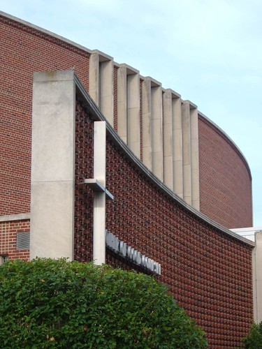
Mother of Good Counsel Church, Lisbon at 70th, Milwaukee Wisconsin. Built 1966-68.
How have I never seen this place before???
It's a beautiful massing of a curved brick screen wall, capped with limestone and studded with protruding bricks, behind which stands a diamond-shaped sanctuary with narrow bands of stained glass.
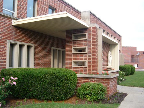
Next to it is a small parish office building, which brings together a number of fairly typical Mid-Century design elements (the vertical pier intersecting the horizontal plane, the rectangular cutouts, the limestone surrounds), but in an unusually high density -- and with a couple of elements I've never seen before.
Most flabergasting is this original doorway:
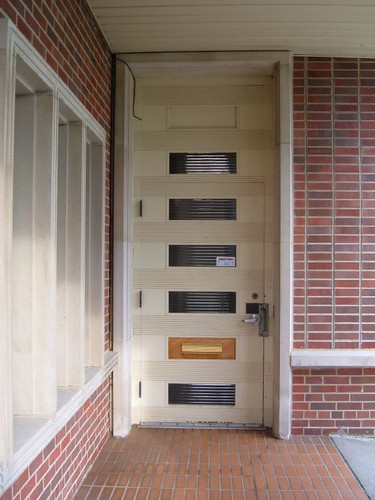
I can't believe they designed this -- let alone that it's still here 40 years later. Magnificent!!
Click the images for more photos.
Wednesday, May 31, 2006
No apologies for the Century Building
Circa 8:30pm, Sunday evening -- the night before Memorial Day, a holiday weekend. My lovely ladyfriend and I are strolling back to our hotel after a visit to the Gateway Arch grounds (during which I ranted at length about the physical disconnect between the Arch and the city it symbolizes). It's getting late, and we're getting hungry.
TGIFriday's, the first place we come upon, is mobbed, seemingly with Arch tourists -- a 20-30 minute wait. The new place on the other end of the block is the same way. We're hungry, don't want to wait. We keep going.
The rest of the way, we don't see a soul on the streets. We don't pass a single bar or open restaurant. We hardly see a light anywhere. Downtown was deserted. I had a hard time explaining to my companion how this could be.
We ended up driving down to Soulard, where we promptly found a local bar that seated us immediately and served us a tasty meal.
Monday morning, 7:30am, I wandered the same downtown streets. In 20 minutes, I saw a total of 7 people. Then I came across a lone Starbuck's, open for business and doing quite well, with a dozen or so customers coming, going, and sitting.
My points?
- There's still untapped potential downtown. The businesses that were open were doing well.
- Downtown still has a long way to go to become a working urban environment, and therefore
- Downtown cannot afford wastes of urban potential, and therefore
- Tearing down the Century Building and all the office, residential, and retail space it could have held was a huge mistake, and putting up a garage in their place is an even bigger one.
Wednesday, May 10, 2006
Goodbye and good riddance to the Whaling Wall
Milwaukee lost an iconic landmark this week, and I couldn't really care less.
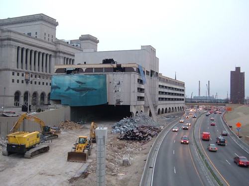
The "Whaling Wall", a mural by an artist known as Wyland, adorned the Milwaukee County Courthouse Annex since 1997. It was well-known due to its position above the heavily-traveled lanes of I-43 southbound. There's been some hemming and hawing about losing the mural, which was demolished this week along with the last remnants of the aging, decaying Annex, a 1960s parking garage with a level of offices on top.
Frankly, I say screw the wall.
There are no whales in Milwaukee. In the wild, there are no whales within a thousand miles of Milwaukee. There is no aquarium here (well, that's due to change this year with the opening of the new Discovery World building, which will feature a modest aquarium.) The whale mural, basically, has jack all to do with this town.
It is simply an advertisement for Wyland's art business, and a rather kitchy one at that.
The mural is hardly unique; Wyland has plastered them on buildings all over the country. And Wyland is hardly some starving artist struggling to find an audience; his web site is a slick commercial venture that looks primed for commerce on a fairly massive scale. For once, I agree with County Executive Scott Walker -- make the guy pony up to plaster his ad on the side of a public building. And for love of all that is holy, keep it off the pristinely Modernist building of the Milwaukee Public Museum, which Wyland has apparently been slavering over for ten years.
So, let the commuters lament the loss of the whale wall. I'll celebrate the now unobstructed County Courthouse, an impressively massive Classical building that looms over the freeway like a mountain. There are causes far more worth fighting for in Milwaukee than preservation of a lowbrow mural.
Saturday, April 01, 2006
Modernist Churches in Milwaukee
Milwaukee has a nice collection of 1950s-1960s era Modernist churches, which make for a nice around-the-town tour as they're scattered across the inner suburbs and newer areas of the old city.
Click on any of the photos to view lots more of them on my Flickr.com account.
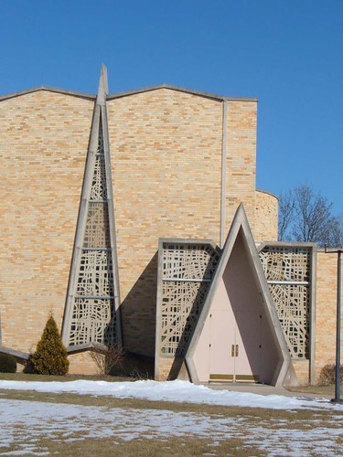
St. Stephen Martyr Church (now Chapel), N. 51st Street - 1969
A symphony of piercing angles and lapping shadows.
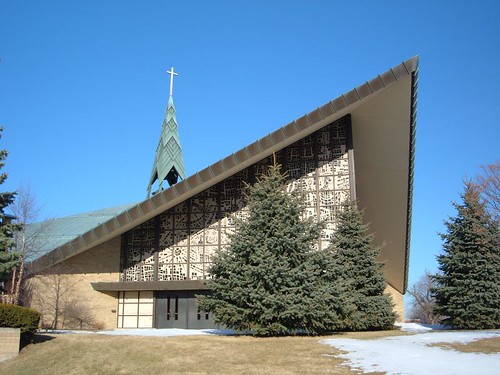
St. Matthias, 9300 W. Beloit Road - 1967
It features a finely detailed roof more powerful than a ship's prow, and a commanding corner wall of stained glass that glows spectacularly in the afternoon sun.
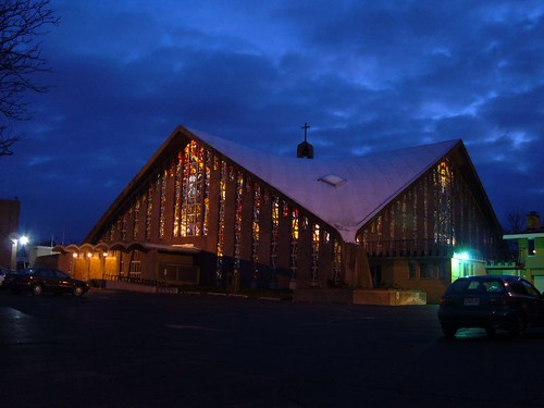
St. Rita, S. 60th Street
A glowing lantern of a building, with half the walls washed away by stained glass. The original architect returned to oversee a restoration in 2003, shortly before his death. It suffers from it city context; it's clearly an object, meant to be sitting like a crown on a hilltop.
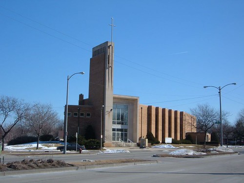
Walther Memorial Lutheran Church, 4000 W. Fon du Lac - 1954
Fairly stock low Modernism -- right down to the characteristic orange brick.
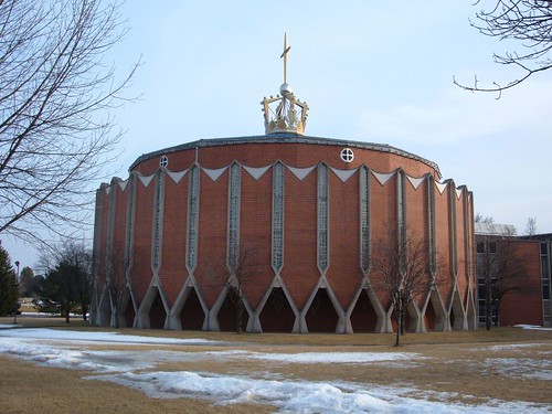
Sacred Heart Academy and Monastary, 7300 S. Highway 100, s. of Hales Corners
Robert Venturi would call it a duck -- it's a building in the shape of the object it represents, in this case a giant crown. But within the bounds of the kitchy overall design are a number of enamoring details, including a wonderful arcade.
Click on any of the photos to view lots more of them on my Flickr.com account.

St. Stephen Martyr Church (now Chapel), N. 51st Street - 1969
A symphony of piercing angles and lapping shadows.

St. Matthias, 9300 W. Beloit Road - 1967
It features a finely detailed roof more powerful than a ship's prow, and a commanding corner wall of stained glass that glows spectacularly in the afternoon sun.

St. Rita, S. 60th Street
A glowing lantern of a building, with half the walls washed away by stained glass. The original architect returned to oversee a restoration in 2003, shortly before his death. It suffers from it city context; it's clearly an object, meant to be sitting like a crown on a hilltop.

Walther Memorial Lutheran Church, 4000 W. Fon du Lac - 1954
Fairly stock low Modernism -- right down to the characteristic orange brick.

Sacred Heart Academy and Monastary, 7300 S. Highway 100, s. of Hales Corners
Robert Venturi would call it a duck -- it's a building in the shape of the object it represents, in this case a giant crown. But within the bounds of the kitchy overall design are a number of enamoring details, including a wonderful arcade.
Sunday, March 26, 2006
Thoughts on the Philadelphia Skyline
I was in Philadelphia a couple of weeks ago, a wonderful, amazing city where I spent three very happy years living and working. It's a second or third home for me, and I very likely will end up back there some day.
So, after getting back home, I'm browing PhillySkyline.com, and I see that the city's getting a new tallest building: the Comcast Center.
Alright, now, people, help me out here. Is this thing not the ugliest thing to go up since the Mellon Bank Center?
I mean, okay, some background here for our non-Philly readers. See, way back when, City Hall went up, and it was the tallest thing around. And a "gentleman's agreement" kept every building thereafter lower than the top of William Penn's hat. To this day, people harp on and on about what a wonderful arrangement that was. But, dear reader, I challenge you: go rent the first Rocky movie. Pay attention when he's on the Art Museum steps. The camera pans around, and you get a great view of the Philadelphia skyline, circa 1975. One thing is immediately obvious: it's dull. It's flat-topped, dominated by uninspired, monotonous, ugly boxes, all of which are chopped off flat just below the top of that hat. And the statue atop City Hall, not to mention City Hall itself, is buried under all of it. The "gentleman's agreement" -- kind of stupid to begin with -- was a mockery by that point, a mere technicality. Billy Penn was already lost in the forest of deathly dull skyscrapers.
Enter Liberty Place. In 1987, developers finally threw tradition to the wind, and put up this magnificent glass high rise, designed by Helmut Jahn. It's a masterpiece, a symphony of multi-shaded blue glass climbing fervently to the sky, one setback emerging after the next, reaching its peak in a soaring pinnacle. I love it; it's undeniable proof that a modern glass building doesn't have to be horrible or anti-human. It can be beautiful; it can be inspiring. With the limit thus broken, half a dozen more tall towers followed in as many years. And while I don't approve of all of them, the fact remains: Philadelphia's skyline was remade, carried out of the 1950s at last and given the scale a city of its size deserves.
Now, Philly's getting this awful thing. It's the World F***ing Trade Center (which, I'm unashamed to say, were really ugly, awful buildings), with a couple of minor notches cut out, rendered in endless sheets of glass. With its massive flat roof, it meets the sky with all the grace of a sledgehammer meeting a wine glass. The renderings show nothing to give it any sense of scale; it appears to have been blow up directly from a 1/100th scale model.
I have no problem with a building surpassing Liberty Place, but can't it be done with the slightest bit of grace?
Also, I don't think much of the Circa Center, either. Monolithic, abstract forms belong in a sculpture garden, not a skyline.
(Also, man, this site is distracting. Look!! That was where I lived in Philly! Our front porch is on the very left edge of the photo.)
Tuesday, February 28, 2006
Updated the old Other Cities link page this evening, a page I've hardly touched in years. It just warms my heart to see how many of the sites have gone legit, migrating from the likes of AOL and Geocities to their own custom addresses.
At the same time, I wonder how I ever even found Victorian Secrets of Washington, a like-minded DC-based site. I tried searching for it on Google with some common terms (Washington DC abandoned, buildings, architecture) and didn't find it.
That could mean there's some site out there about Philadelphia, something I'd just kill to see. If any reader knows of such a thing, please let me know!
Sunday, February 26, 2006
Farewell to West Milwaukee
I passed by West Milwaukee today, the industrial-based inner-ring suburb attached to Milwaukee's western flank. The road running south from Miller Park stadium has long been a fascinating vista of towering grain elevators -- almost a hundred of them -- and mighty factories. It was a land of heroic architecture, concrete mountains that stood pure and powerful and enormous in the slanting light of a late afternoon sun.
But, no more.
Last summer, with the 2003 closure of the Froedtert Malt Corporation's West Milwaukee operation and a corn milling plant run by Archer Daniels Midland company a year later, a series of the grain elevators began coming down; this month, most of the remaining ones are coming down, as I discovered this evening. Layers of building have already fallen, revealing a second layer behind them. Generic big box retail will replace them all, as Miller Park Way (still known as 43rd Street elsewhere in the city) evolves into another version of S. 27th Street.
How depressing. One can already surmise what's going to go into this place, how dreadfully dull and boring it's going to look, how placeless and forgettable.
Even if I'd had my camera, the light was already too dim for photographs. I don't know when I'm going to be able to get out there in daylight -- maybe Friday. The old axiom proves true yet again: photograph now, for it'll be gone next time you're there. Only the southernmost stand of Froedtert elevators remain untouched, and I'm sure their time is coming up quickly.
Photographs from January, 2004:
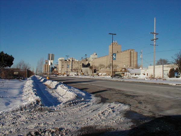


I've always loved the bizarre juxtaposition of the lightweight Italianate office/research building with the massive, purely functional behemoths directly behind it. The office is gone now, reduced to a few chunks of concrete foundation. The elevator won't be far behind.

Photographs from October, 2004:


The old Hotpoint Appliance factory across the street, with its stout smokestack and multiple rail spurs curving into its grounds, is now stripped of facade and in mid-demolition.


Demolition photographs from July 2005:


Up the street, new suburban-style strip malls are sprouting faster than the weeds growing between the railroad ties. The very character of this part of town is transforming before our eyes, a tidal wave shift from industrial to residential and retail. I can't fathom what recyclable use such a gigantic collection of industrial structures might have, but I still feel keen regret at the change: when it's over, I won't really have any reason to stop along this stretch of road again. Everything that made it unique, everything that gave it such a commanding presence, will be gone.
But, no more.
Last summer, with the 2003 closure of the Froedtert Malt Corporation's West Milwaukee operation and a corn milling plant run by Archer Daniels Midland company a year later, a series of the grain elevators began coming down; this month, most of the remaining ones are coming down, as I discovered this evening. Layers of building have already fallen, revealing a second layer behind them. Generic big box retail will replace them all, as Miller Park Way (still known as 43rd Street elsewhere in the city) evolves into another version of S. 27th Street.
How depressing. One can already surmise what's going to go into this place, how dreadfully dull and boring it's going to look, how placeless and forgettable.
Even if I'd had my camera, the light was already too dim for photographs. I don't know when I'm going to be able to get out there in daylight -- maybe Friday. The old axiom proves true yet again: photograph now, for it'll be gone next time you're there. Only the southernmost stand of Froedtert elevators remain untouched, and I'm sure their time is coming up quickly.
Photographs from January, 2004:


I've always loved the bizarre juxtaposition of the lightweight Italianate office/research building with the massive, purely functional behemoths directly behind it. The office is gone now, reduced to a few chunks of concrete foundation. The elevator won't be far behind.

Photographs from October, 2004:


The old Hotpoint Appliance factory across the street, with its stout smokestack and multiple rail spurs curving into its grounds, is now stripped of facade and in mid-demolition.


Demolition photographs from July 2005:


Up the street, new suburban-style strip malls are sprouting faster than the weeds growing between the railroad ties. The very character of this part of town is transforming before our eyes, a tidal wave shift from industrial to residential and retail. I can't fathom what recyclable use such a gigantic collection of industrial structures might have, but I still feel keen regret at the change: when it's over, I won't really have any reason to stop along this stretch of road again. Everything that made it unique, everything that gave it such a commanding presence, will be gone.
Tuesday, February 14, 2006
Built St. Louis: The *shudder* Blog
Welcome to my new Web Log**. I don't have a firm plan for this item yet, but for now it's intended to do several things:
- replace the Guest Book as a place for readers to leave general comments on the site. The existing Guest Book is obnoxious to look at and is constantly bombarded with spam, which I must waste my time removing one post at a time.
- provide a forum for the occasional urbanist/architectural rant that crosses my mind, about St. Louis as well as the other cities I visit (and live in, in the case of Milwaukee.)
- provide a forum where the site's readers may respond to each other (and I directly to them as well.)
It's not likely to stay up on all the latest news in the city; I point you to my recently-added blog list for several fine writers who do that better than I can. Somewhat from necessity since I live 6 hours away, I tend to look at broader strokes within the city of St. Louis, seeing the big picture from afar rather than zooming in on the intimate details.
With this web site, I feel my first imparative is to provide images of the city, high in both quantity and quality, for in making the case for the wonderous cityscape that is St. Louis, a photograph has a value beyond the capability of any words. I am a compulsive documenter, and have long been moved to record and spread the word of what's happened to the city in my time there, especially the outrageous abandonment and destruction of the city's wonderful architecture.
Concurrent with that is a second agenda: to push for urbanistic growth. I adore cities: not just their architecture, but their vibe, their pulse and vitality, their sense of community, the feeling they give me that I am somewhere! Three years of living in Philadelphia absolutely sold me on big-city urban life -- on having a hoagie shop 30 seconds from your front door; on being a 10-minute trolley ride from downtown; on having endless miles of neighborhoods to explore; on always having a place nearby where people are gathered, where there's always a crowd (I don't know how a city can really thrive if it doesn't have some version of Philly's South Street.) I want other cities to have that sort of pulse and vigor. I want to be able to live in places where people walk and bike and take the bus to get where they're going (and it's not a pain in the ass to do so.) I want it because I think it's more sustainable, better for the environment, the community and civilization at large, and because I'm selfish that way.
But to grow and thrive, cities need people. The political boundaries of St. Louis hold about 40% of the population they had 50 years ago. It's not enough to sustain vigorous urban life -- not nearly enough; the city today is riddled with dead zones, large voids that disconnect the few functioning urban spaces from one another. And those people have to be densely concentrated -- a phrase that probably conjurs up horrific images of tenement conditions (or at least a terrifying lack of quarter acre lots) in the American psyche, when it should bring to mind luxurious condos and handsome townhouses.
I hear from unfortunately large numbers of site visitors who moved away decades ago, and are skimming through the site reminiscing; they write to comment what a shame it is that so many buildings are falling apart, that so much history is being lost. The city needs those people back!! St. Louis fell apart because people left it. The reasons are innumerable, but it all boils down to lots of good, honest citizens taking off for greener pastures.
So my second mission is to sell the city -- to show the beautiful architecture that forms St. Louis's greatest inherent asset, in the faint hope that maybe it will help nudge people back towards urban living, both in St. Louis and elsewhere -- another pebble rolling down the hill, trying to start an avalanche.
I get occasional emails requesting that this building or that neighborhood be added to the site. Sometimes they're in the works; sometimes I've never heard of them, and I go track them down when I'm in town (reader requests are responsible for one of the Modernist hospital chapels, the 2300 block of Dodier, St. Cecilia Catholic Church, and various others); sometimes it's a building long-demolished and there's not much I can do.
I have lots of big plans for the site, plans that will take years to bring to fruition; furthermore, as the site grows, it becomes increasingly difficult to keep up with all the changes to places and buildings I've previously documented. My backlog of photographs waiting to go up is enormous. My whirlwind weekend visits to St. Louis rarely last more than two days, never enough time to revisit all the places I've documented. Heck, I can barely find time to answer email these days. I ache to start a site about Philadelphia's architecture; I have hundreds of amazing photographs from my time there -- but I just don't have the time to scan them, organize them, figure out where they were taken, and put up pages.
Heh. If anybody knows how I can quit my job and make my living doing this, let me know.
** "Blog" = "weB LOG" -- except that "web log" is a fine and tasty phrase, whereas "blog" is one of the most hideous and misbegotten words to enter the English lexicon in my lifetime. It rolls off the tongue like a Panzer tank going over a cliff at 4 miles per hour. I despise it and utterly rebuke it, and renounce its use henceforth and forthwith. Bleh!
Subscribe to:
Comments (Atom)