Sunday, December 23, 2007

Making It Expensive in the Lower 9th

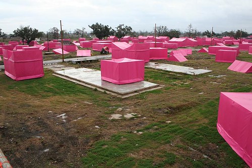
In an amazing convergence of fame, money and humanitarianism, Brad Pitt is sponsoring a rebuilding project in New Orleans' devastated Lower 9th Ward. The northern half of the Lower 9th was directly in the path of a break in the Industrial Canal, with many houses being crushed by an errant barge that drifted through the breach. 2 years after the hurricanes, most of the house remains have been removed, but there's virtually no rebuilding going on.

City of pink

Pitt's project is named Make It Right 9, and there's a good writeup about it at the Poverty News Blog. As part of the project, a range of architecture firms were invited in to create prototype house designs for the neighborhood.

I had the chance to view the house designs this week. I applaud the intent behind the undertaking, but some of the designs really made me wonder what the architects were thinking.
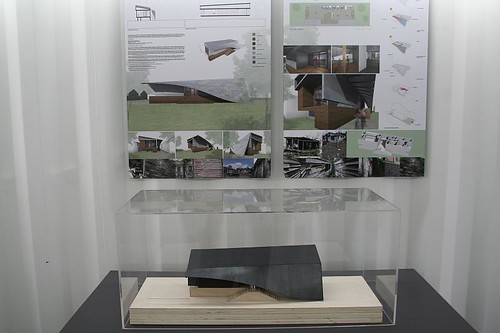
The beached whale

Many of the houses feature crazily angled walls and roofs, bizarrely bent forms that would require a master carpenter to build (or a computerized factory.) One looks like it was picked up by a flood and smashed in the middle, its back broken as though a bus (or a barge) had landed on it -- ho ho, oh, ironic commentary! What wit! If I were a survivor of the post-Katrina catastrophe, I think I'd feel insulted.
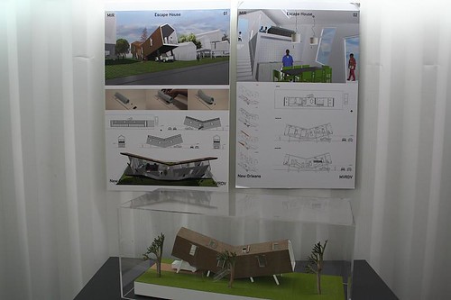
What the hell is this?

Several of the designs, however, seemed to show true interest in economy (ie, ease and speed of construction, the use of common and widely available methods and materials, not to mention use of common design elements that have made New Orleans buildings survivable for a century or more), which is what's truly needed to bring back an entire neighborhood. I particularly liked the one that featured a house whose walls are largely made of premanufactured modular storage cabinets, with a straightforward roof dropped on top. Simple to design, easy to erect in the field.

The green features are also of interest, though I wonder what the startup costs vs. long term savings are.
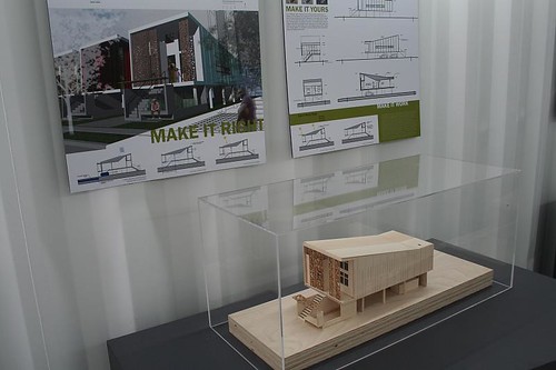
Not bad

Ultimately, the problem is not a lack of design concepts. You can wander New Orleans and find a dozen or so tried and true house designs that have weathered a hundred years of the city's notorious heat and humidity and torrential rains. The problem is that hundreds or thousands of new houses are needed, right now. This means they have to be done quickly and affordably.

So again, I wonder -- what were some of the architects thinking? Was their intent to construct houses on a tight budget as a reproducible precedent, or merely to show off their bleeding-edge designs capabilities? Is theirs a humanitarian effort, or just jumping on a chance to jerk off, to experiment at the possible expense of the poor?

The full roster of designs can be seen here. Most of the projects featured descriptive text on their display boards, but sadly that text is not reproduced on the web site.

Tuesday, December 18, 2007

Notes from New Orleans

So all that snow that fell Friday and Saturday? Sorry, sorry, that was me. I came through town with my bicycle in tow, thinking I might get out and do a little bit of riding. Ha! I still had a pretty great weekend in St. Louis, though. Photos to come in January!

The weather in New Orleans has been much kinder, fortunately, and I just finished the first of several days riding around town. A few thoughts:

  • New Orleans' flat topography and warm climate may make for easy bike travel, but otherwise the city is one of the least bike-friendly places I've been. There are no bike lanes to be found in the Garden District, French Quarter, or downtown. The streets are narrow, pinching bikers between racing traffic and parked cars. Despite it being a pleasant 65 degrees or so, I saw almost nobody biking today. It's a bit inexplicable considering how accommodating parts of the city are for the pedestrian.

  • Even disregarding the memory of what happened there in September 2005, the Superbowl and its environs are a horrible and inhuman place. The building itself is a mammoth superblock, with low-rise wings and parking garages taking up a vast area of downtown. Surrounding half of it are Interstate overpasses, cutting off roads and funnelling westbound traffic from downtown onto a limited number of routes. It's a classic example of the awful "urban" planning of the 1960s, all plopped down on the edge of what is otherwise a delightful downtown. The building itself, seen from ground level, looks like an arena of doom. I can't imagine how it must have looked to the poor souls who dragged themselves there on foot across a flooded city, with no idea what they might find within.

  • The Garden District and the surrounding neighborhoods are astonishing in their endless delight and vast architectural variety. And the neighborhoods just to the north are abuzz with construction and rebuilding activity.

    Tomorrow's travels: Charity Hospital, Canal Street north of downtown, Marigny, Bywater, and more!
  • Sunday, December 09, 2007

    You too can fly

    I would just like to reiterate to everyone out there what an astonishing tool Maps.Live.com is, especially the Bird's Eye View. Some examples:

    - The exact point where the Mississippi and Missouri Rivers merge.

    - US Steel's Granite City works.

    - Metro East Industries' locomotive salvage works at Alorton

    - Cahokia Power Plant

    - Just across the river, the ruins of the minesweeper vessel Inaugural.

    - Ruined neighborhood in Wellston, now demolished.

    - Tidy streets by O'Fallon Park in north city.

    The combination of birds-eye and map/satellite hybrid lets you soar over the land like a god, peering into the hidden worlds of industry and abandonment, granting you an overreaching vision of the lay of the land. In the case of recent demolitions, it grants the user a window into the recent past, as the photographs date from around early 2006. And it has let me identify the exact locations of photographs that I took with only the barest idea of where I was.

    Sadly, a huge swath of western St. Louis is missing from the Birds Eye feature -- basically anything west of Midtown and south of University City.

    Wednesday, December 05, 2007

    On Washington Avenue, a remarkable transformation

    St. Louis has a long and not-so-proud tradition of bad Modern architecture.


    Bad Modernism is so pervasive, in fact, that I blame St. Louis for making me hate Modernism for many years. It took a trip to Europe, and the roadside enthusiasm of several friends and acquaintances, to make me change my attitude.

    And even after re-evaluation, much of St. Louis's more prominent Modernism doesn't hold up. Washington University has so much bad Modernism (Busch Labs, Monsanto, Mudd Hall, Compton Hall) that it's no wonder they've opted to scrap the idea entirely. It's enough to drive a body to Postmodernism.

    What a shock it was, then, to drive past the old Days Inn at Washington and Tucker.


    From a kitschy bit of weak 60s roadside Modern, an elegant and classy building has emerged... and with only a minimal bit of aesthetic tweaking. The basic form is still there, the angled window panels that distinctly dated it to the 1960s. But now, with a few simple wise choices in materials, the once-tired building steps into synch with its many renovated neighbors, while still not hiding its heritage. The ground floor is opened up a bit with partial glass facades, and a garage entrance on Washington has been eliminated, making a more pedestrian-friendly environment at the sidewalk.

    The renovated building looks fantastic. Kudos to the owners for not tearing it down!